Overview
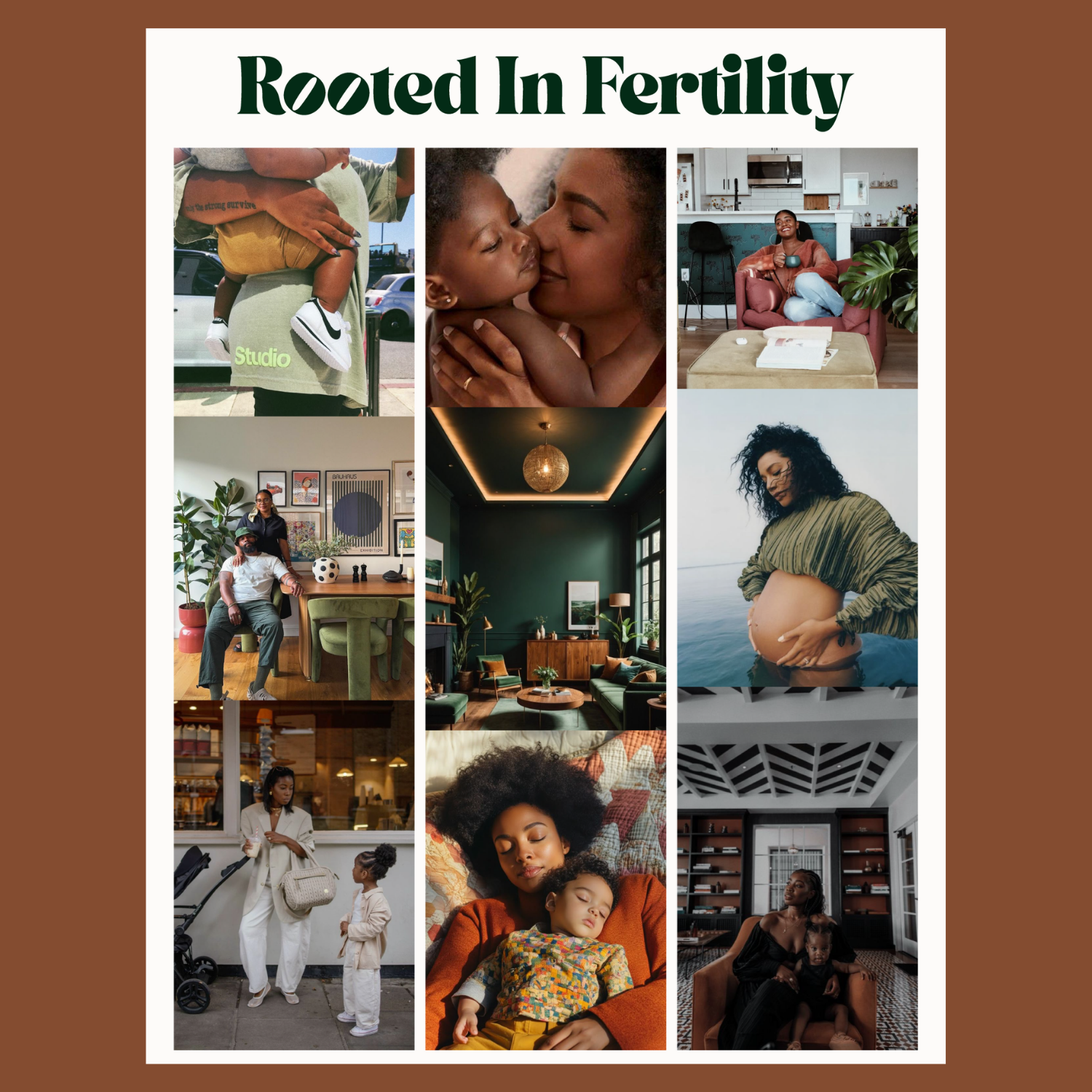
Brand identity and visual system for a fertility advocacy practice serving women who've been made to feel invisible in clinical settings. Rooted In Fertility needed to feel like a warm, fierce best friend—luxurious but never precious, grounded but empowering. We built a "modern organic luxury" identity rooted in Laura's lived experience as a Black woman and IVF warrior.
The Brief
Laura came to us after years of crying in NYC stairwells—navigating miscarriages, six doctors, and a fertility system that rarely made space for her. She wanted branding that would break into a white-dominated wellness space without losing her Southern warmth or her "nothing is TMI" straight talk. The challenge: create something that felt premium and inclusive, editorial but approachable, and distinctly her—not another botanical fertility brand with soft pink watercolors.

What We Created
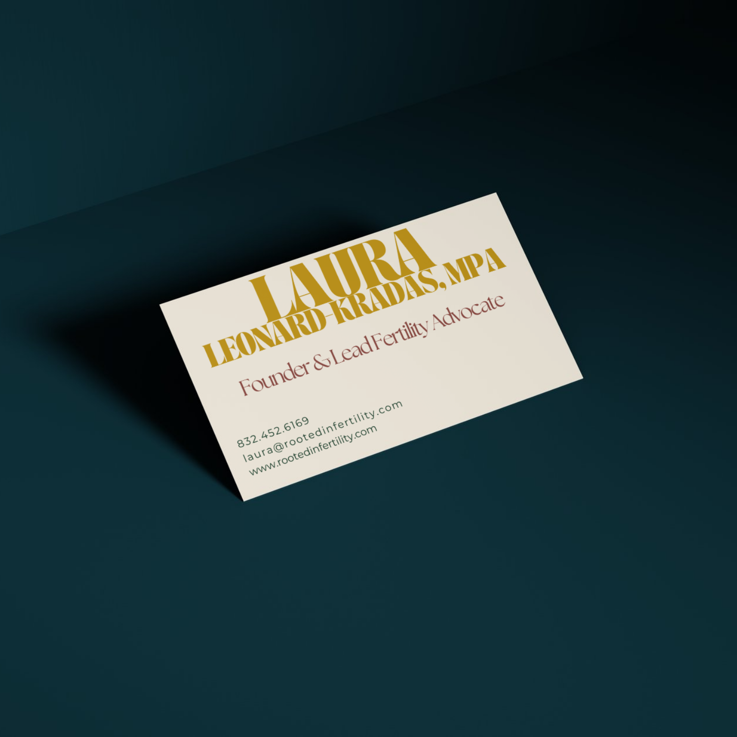
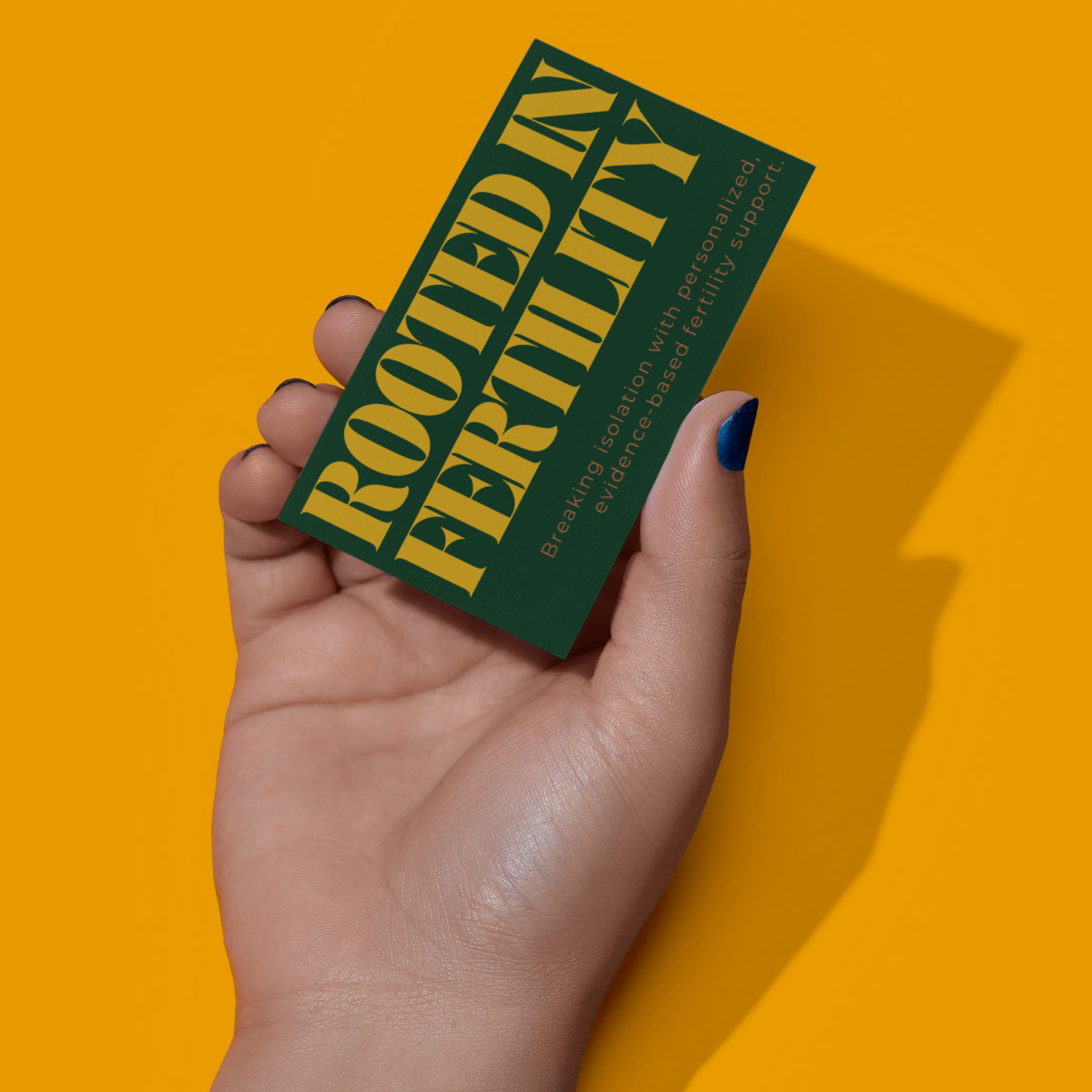
Logo refinement (transforming the existing tree mark into a more luxe, streamlined wordmark)
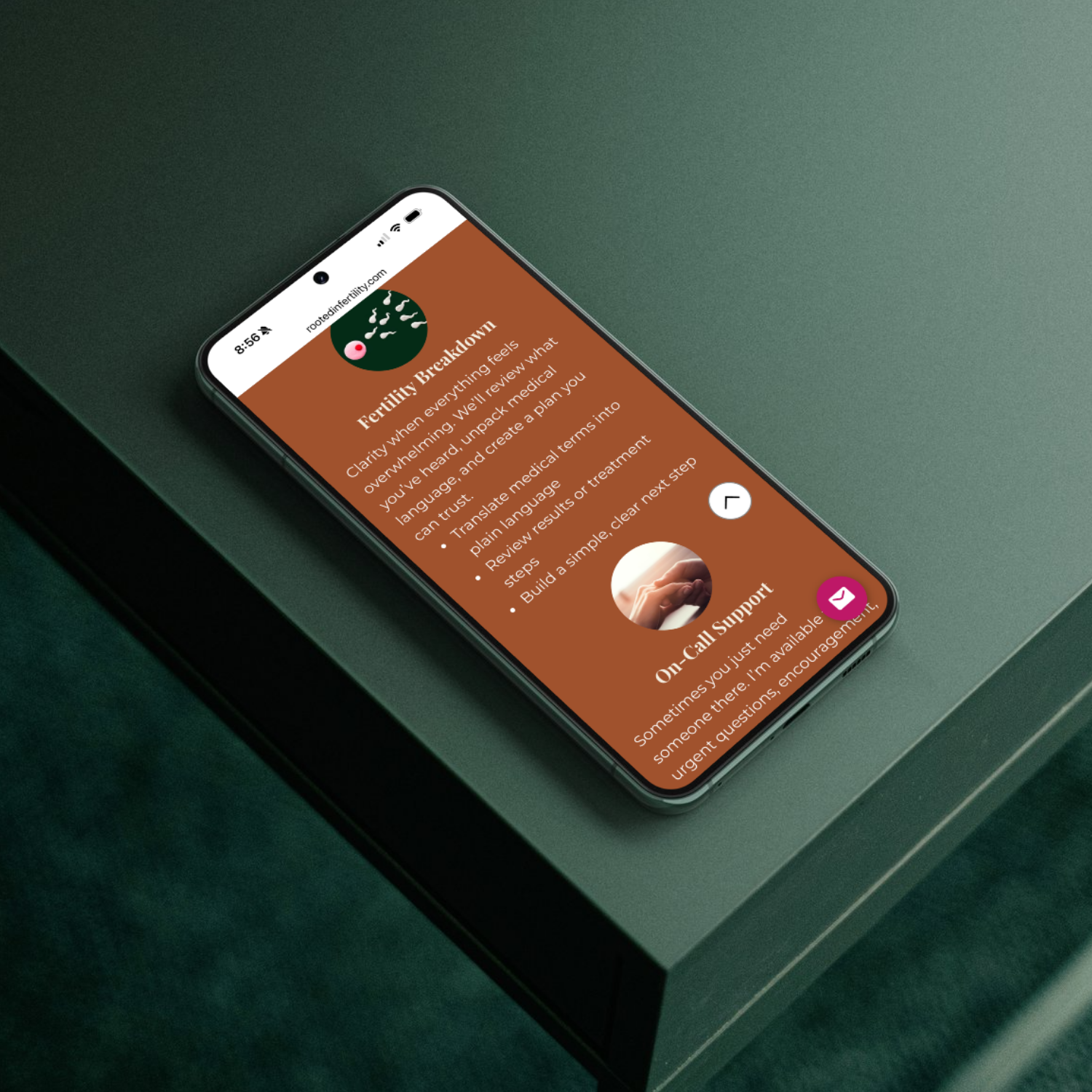
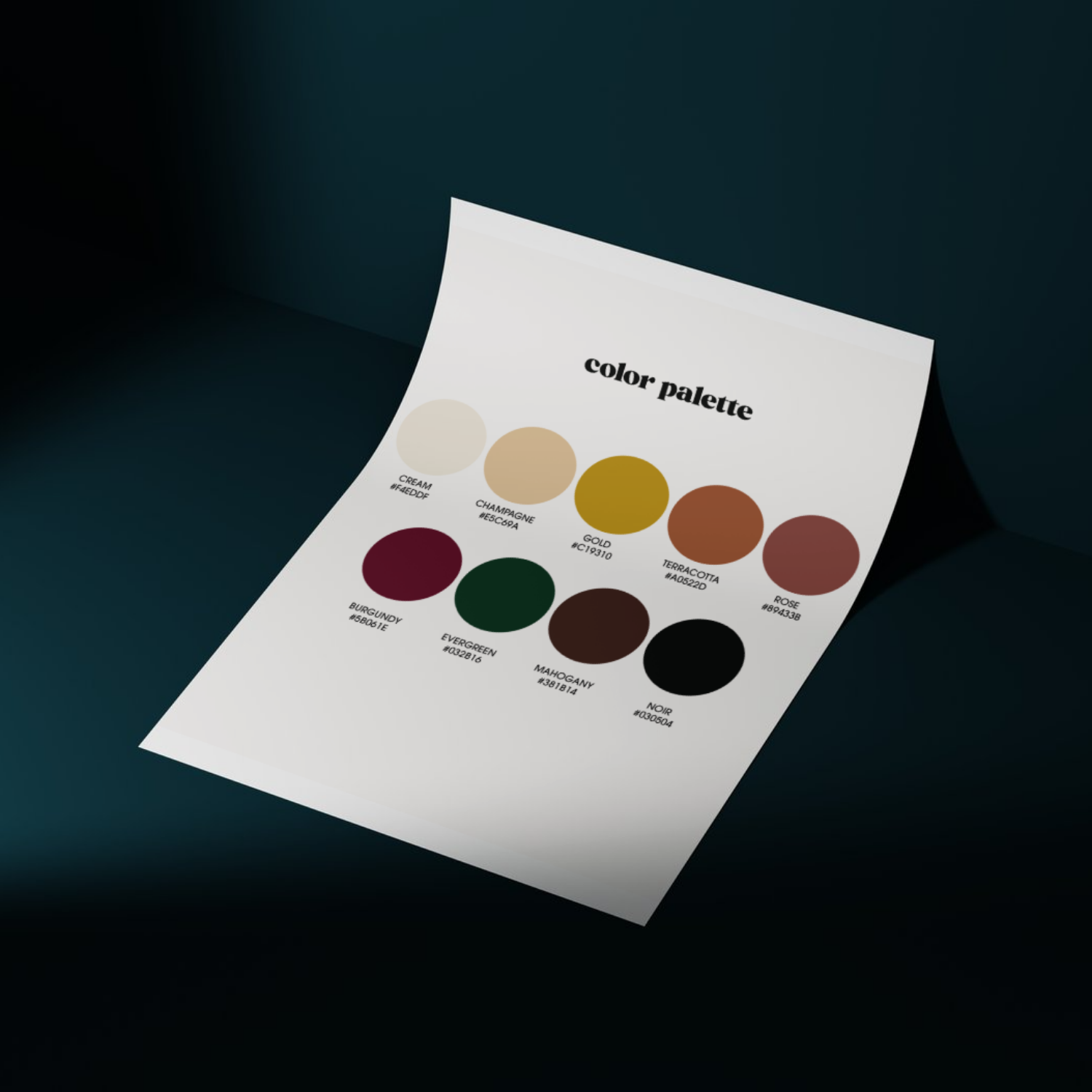
Full color system built around her vision: rich chocolate brown, "Black girl green," warm gold, and jewel-tone accents
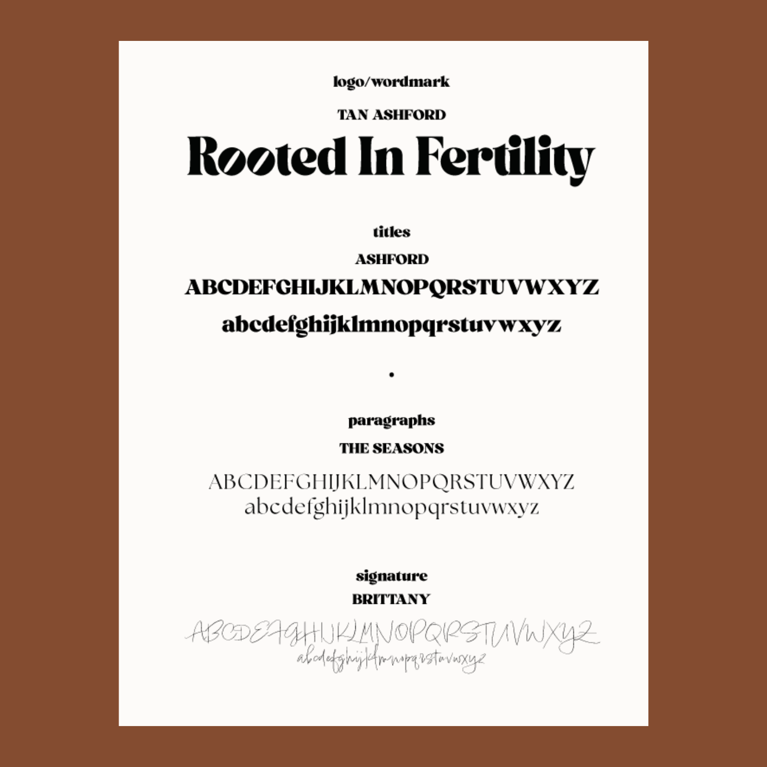
Typography pairing that balances editorial sophistication with warmth
Brand guidelines
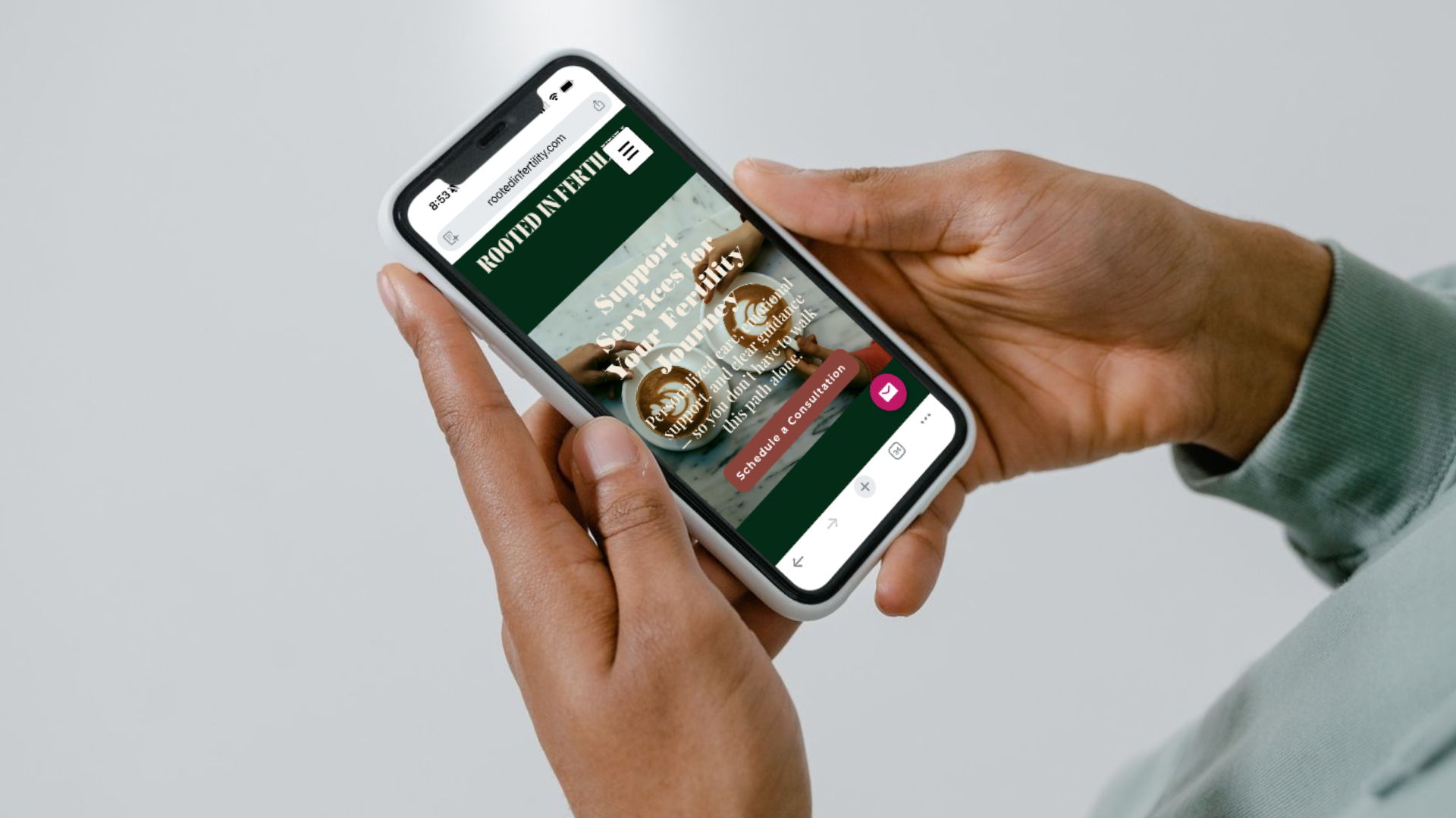
Social media templates for YouTube, TikTok, and Instagram